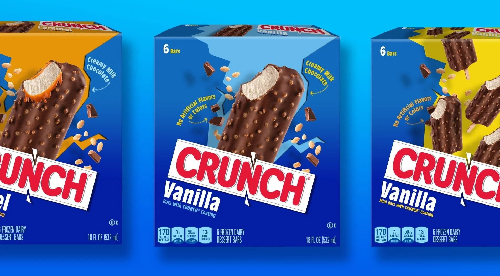
Crunch Bars Ice Cream Refresh
Crunch bars ice cream is a summer time classic but needed a slight facelift to stand out amongst other bar to dairy treat competitors. The client initially wanted to explore bold creative options, but amendments and compromises simplified a concept to a modernized iteration of their original design.
BEFORE The original packaging was minimal, relying on the iconic brand deep blue and prominent logo to attract an already loyal fanbase familiar with the chocolate bar. The cavernous amount of negative space doesn’t provide a stage for the flavor appeal but devours valuable PDP space.
PROPOSED CONCEPT The client provided an updated version of their logo that replaced the explosive break with a minimized symmetrical cut into the N. The loss of kinetic movement left a hole that needed to be filled with much needed visual energy. As a nod to the break, I broke into the background with a colorful chasm that framed a protruding bar and Crunch shrapnel exploding playfully across the space. It is an animated, modern evolution that also provided a channel for potential flavor adaptations.
Minor changes, big impact.
While the client was drawn to the energized placement of the product and addition of the exploding pieces they felt the concept was too divergent from their classic design. The compromise was creating a layout that made practical use of the negative space, adding movement with updated photography and placing the logo prominently, once more, across the PDP.


